Concept Art!
These were quick sketches to play with composition ideas and staging. It’s funny how little these relate to the final look of the animation, although many of the compositional ideas did translate.

These were quick sketches to play with composition ideas and staging. It’s funny how little these relate to the final look of the animation, although many of the compositional ideas did translate.
Read: Part 1 // Part 2 // Part 3
Part 4:
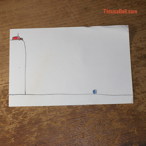
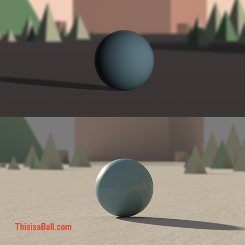
At the end of the first shot I wanted the ball to exit on the right side of the screen. This caused more headaches than it should have.
In film theory the right side of the screen is often viewed (or felt by the audience) as being the open and unknown side of the screen due to our western method of reading from left to right. In the history of western cinema characters often leave “home” by traveling in this direction. When they return they often travel to the left side. (In Asian cinema this screen is often reversed.)
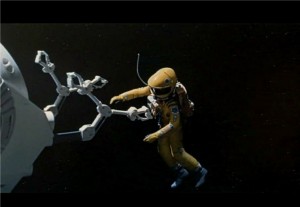
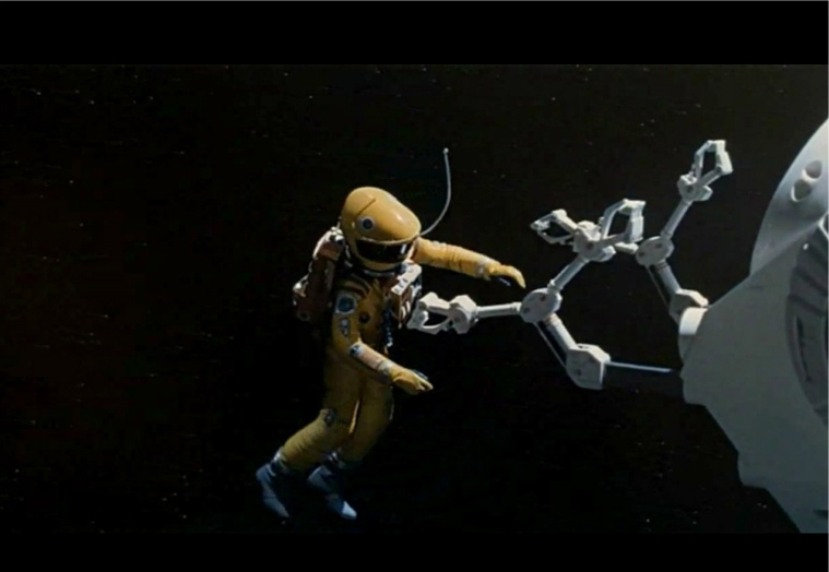
2001: A Space Odyssey has many great examples of this, specifically when Bowman leaves the spaceship to collect his fallen cremate Dr. Poole.
Here is an example from 2001: ASO
Well, now my problem… While my first render follows the color scheme I had developed it felt dark and the background distracting. While I really liked how some of this looks it wasn’t working for me overall. Was I wrong? Share a comment and let me know.
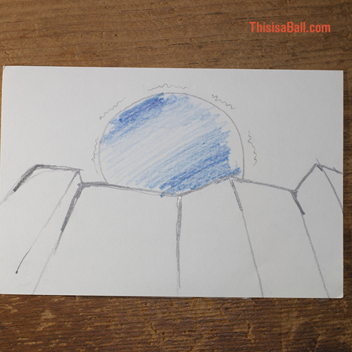
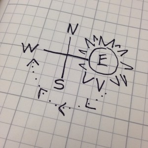
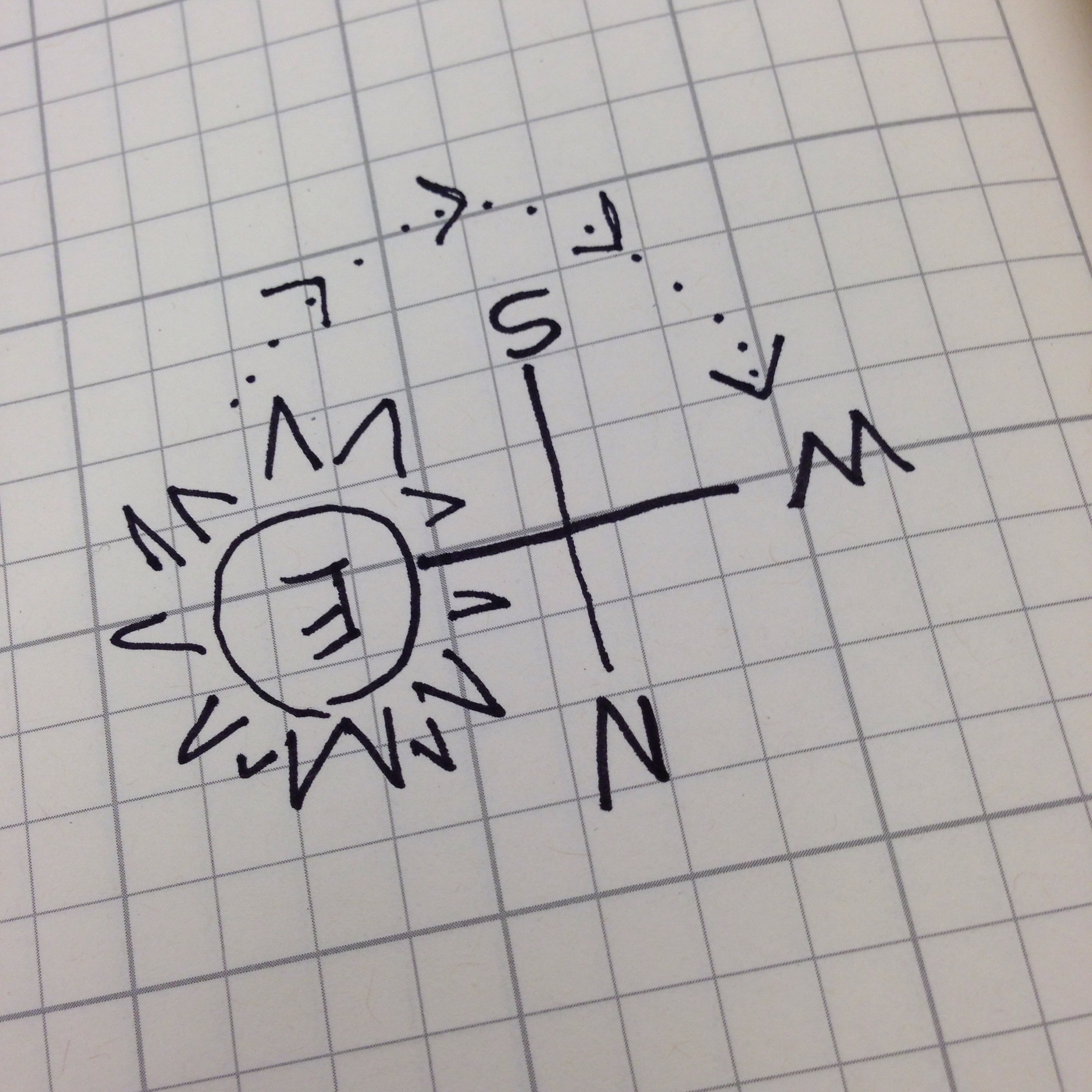
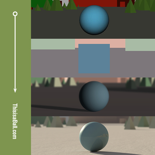
Because we are conditioned to expect north to be on top I had placed the sun to the right, or the east.
As we know from my last post, I wanted the sun to rise and set during the duration of the film. Since I had decided to have the ball travel screen right during the film this would mean that instead of walking off into the sunset in my last shot, the sun would be shining on his back. This doesn’t have the same romantic look. Trust me. I tried it.
The original placement of the sun on top. Final shot on the bottom.
After I revised the colors, I moved the sun to the left side of the screen.
Flipped 180 degrees, the sun still rises in the east and sets in the west. Since this is the first shot I wanted to make it clear that this was a sunrise, not a sunset. To communicate this, I made the colors cooler. I also backlit the ball because if you live north of the equator the sun travels along a southerly path. So, I guess the movie takes place in the northern hemisphere! This also helped to make the opening colder and less emotional. Hopefully this will contrast the warm romantic sunset that concludes the film.
Read: Part 1 // Part 2 // Part 4
Part 3:
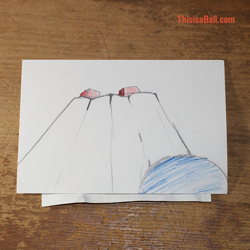
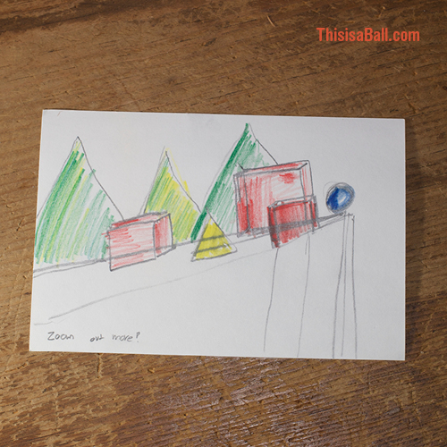
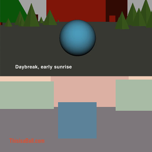
In the top half of the picture below you can see an early un-rendered 3D concept of the opening shot. I wanted the green pyramids to evoke trees and the red cube to add a heavy menacing weight.
Color and lighting was the next big thing to think about. I wanted the light to go from sunrise at the start of the film to sunset at the end. My plan was to try to place “high noon” around the climax of the story. Hopefully this will not be distracting. I guess the reviews will tell.
I researched paintings and photography to gather color ideas. I then translated all of my shots into corresponding color pallets. My goal was to “paint the objects” with the correct color temperatures an then lay lighting on top of that. I hoped this would save on render time as it would reduce lighting complexity and give me additional control. You can see my initial color pallet for this shot on the bottom. Next, Test renders!
Read: Part 1 // Part 3 // Part 4
Part 2:
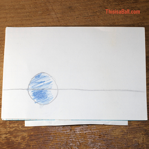
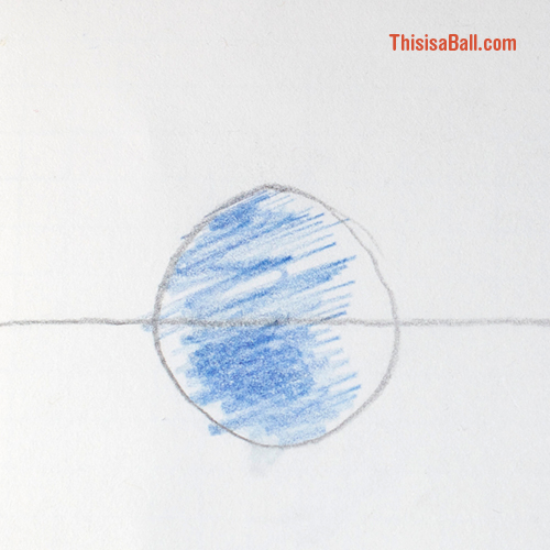
When I had been visualizing this film I pictured the ball as red. Maybe that’s because I have red hair and I saw myself as the ball? Basketballs are orange. The rubber dodgeballs we used in elementary school were red too. So, it was definitely going to be a red ball. But, at the last second I switched my mind and used a blue pencil.
I had written the ball to be a boy. So, using blue helped to suggest that. Also, red is an aggressive color and it would be better suited to the lumbering cubes that would torment my little protagonist. I also knew that the ball would need to blush. How does a red ball blush? On the other hand, blue could easily shift to purple and even red in anger.
Eventually the ball would be rendered as a three dimensional shape and the lighting would prove to be a huge can of worms.
Actually, this film didn’t start with a drawing but instead with insomnia. I was unable to sleep and I was thinking back on all the animation assignments I had done in the various school programs I had taken. Each class always started with a bouncing ball and I began to riff on that concept and put together a poem and an idea for a short film.
I eventually got out of bed. I had to write the poem down and get it out of my head if I ever wanted to sleep. A few days later I decided to begin my storyboard. This was the first drawing of the opening shot. While simple, this ended up being one of the most complicated elements. More to come on that…